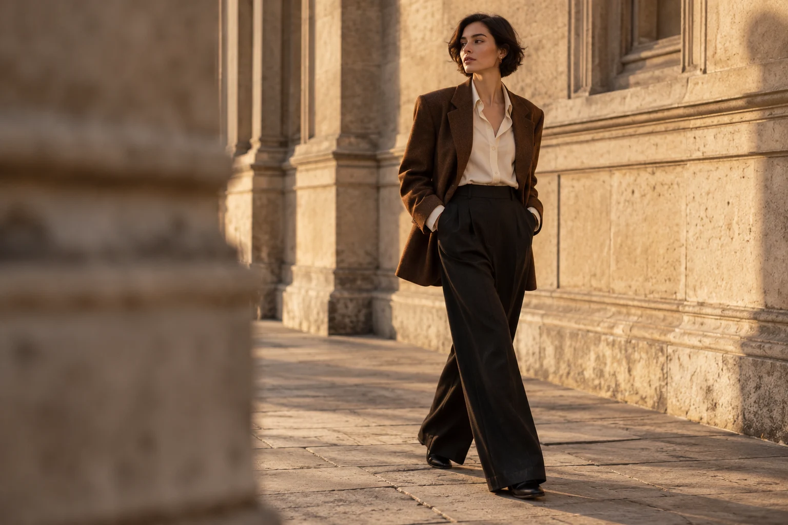
Runway / The big read
What the 2026 catwalk is asking us to reconsider
Layering, saturated colour and clothes with more than one identity. A selective guide to the ideas worth taking off the runway.
Stories you’ve saved in this browser. No account needed.
Layering, saturated colour and clothes with more than one identity. A selective guide to the ideas worth taking off the runway.
Miuccia Prada and Raf Simons make a case for an outfit that changes as you move through the day.
Prada’s Spring/Summer 2027 collection turns a familiar garment into an exercise in variation.

Jonathan Anderson’s couture debut connects botanical forms, collecting and the possibilities of handwork.
Jack McCollough and Lazaro Hernandez put playful making at the centre of their second Loewe collection.
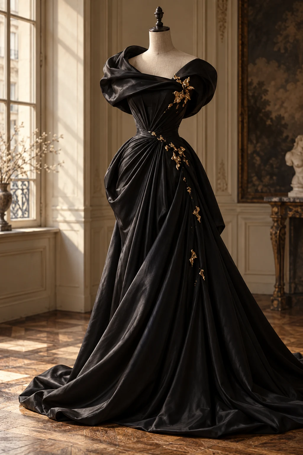
Daniel Roseberry’s The Agony and the Ecstasy offers a useful reminder: fashion can be an experience before it is an outfit.
Gucci’s Primavera collection offers a starting point for reading change at a fashion house.
Use Saint Laurent’s official Winter 26 collection to practise reading a silhouette from head to toe.
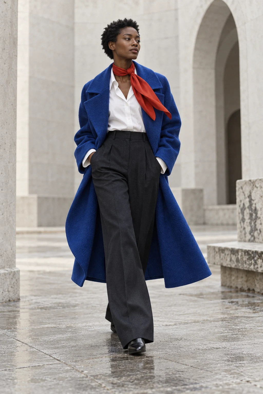
A catwalk pairing with several personalities: graphic, restrained, sporty or unexpectedly elegant.
A dark, complex base and one acidic accent. Here is how to control the contrast.
Warm depth meets a cool, clean interruption. A colour formula to try with pieces you already own.
A restrained way into one of the colours in the Autumn/Winter 2026 conversation.
Use surface, spacing and proportion to give a single-colour outfit depth.
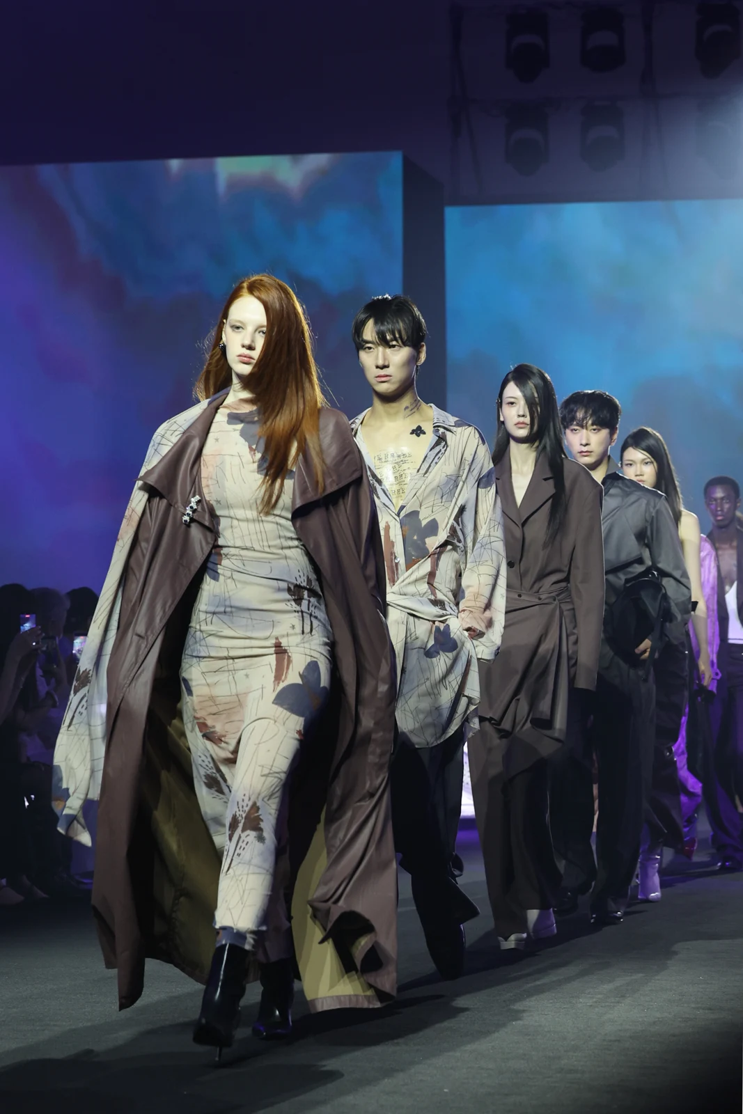
Real runway photographs from 1 September 2026: printed surfaces, long outer layers and the tension between dress codes.
A short guide to reading runway dates without mixing up the year of a show and the season of a collection.
A clearer vocabulary for appreciating high fashion, without using couture as a synonym for expensive.
A more useful way to look at a runway image, from the overall line to the smallest interruption.
A three-step method for turning a catwalk reference into something that feels like your own wardrobe.
Tory Burch’s Fall/Winter 2026 detail offers a useful lesson in looking closely.
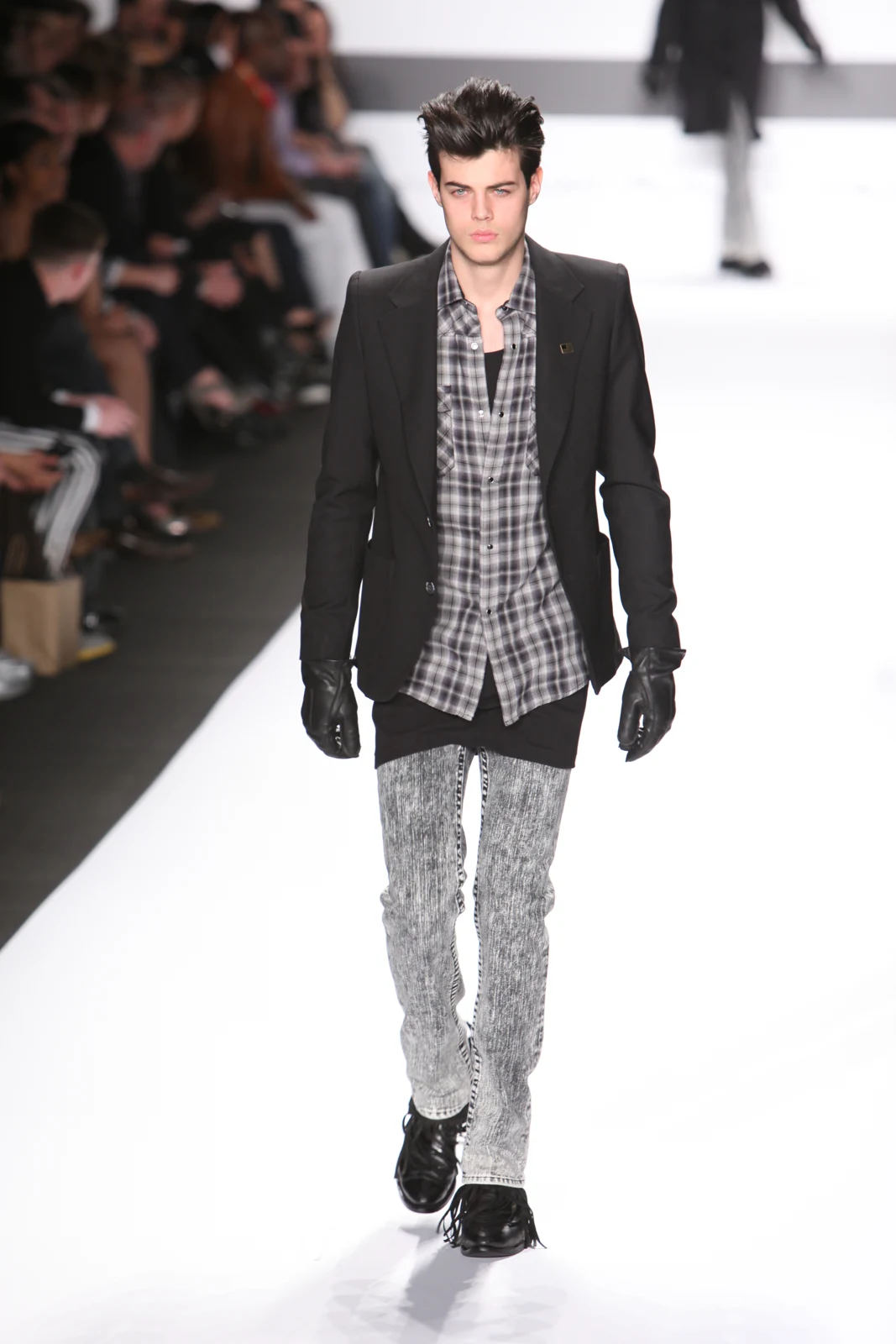
What an old runway image can teach you—and what a single frame cannot prove.
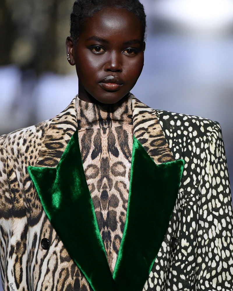
An archival Cavalli close-up is the starting point for an exercise in scale, spacing and a quiet border.
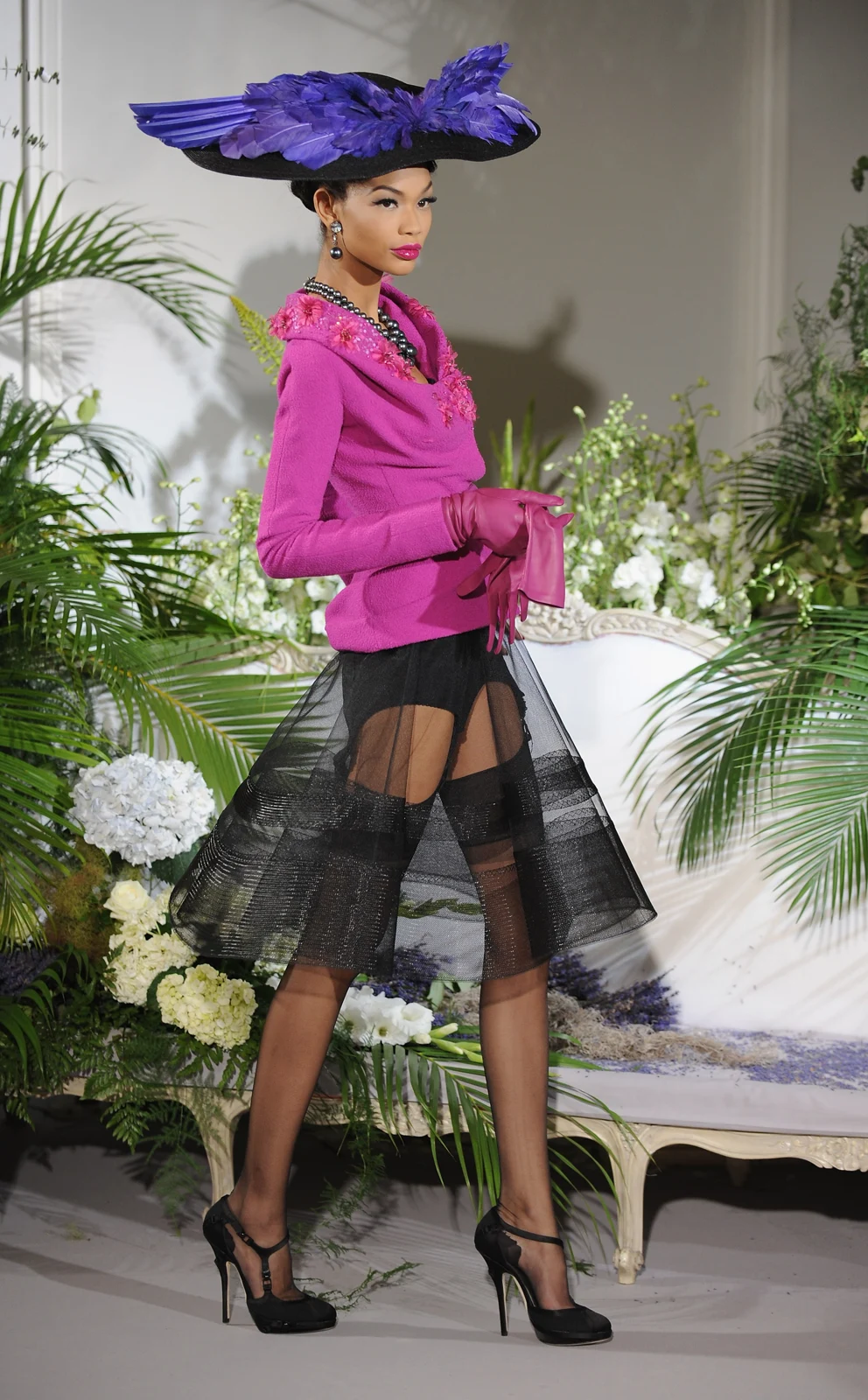
A Dior couture photograph from Paris offers a different way to study volume and proportion.
A 1938 dress offers a way into bias cutting, drape and the difference between simple appearance and simple construction.
Why a garment’s outline can be shaped by the air it leaves inside—and why loose does not mean unconstructed.
An evening dress can be studied through its support, balance and changing outline, as well as its surface.
Yves Saint Laurent’s 1966 tuxedo is a starting point for thinking about formalwear, context and the suit as a complete idea.
Changing the order of making can change the garment. A closer look at the idea behind garment pleating.
Surreal fashion is more than an unusual shape. It can make a familiar object behave in an unfamiliar way.
What changes when “beautiful”, “finished” or “wearable” stops being the first question you ask?
A museum-documented suit reveals how lining, hem and silhouette contribute to a recognisable design language.
One names a fibre; the other describes a weave. Learn what a product description tells you—and what it leaves open.
Two translucent fabrics, two different ways of creating volume. Start with how the cloth falls, not how much you can see through it.
A visible motif does not tell you how it was made. Learn what to inspect before naming a patterned fabric.
Use the colour inside a woven cloth to build an outfit, rather than treating the jacket as one flat shade.
The supporting layer is different from the lining. Here is how to ask useful questions without reducing a jacket to one specification.
The distinction becomes clearer when you look at where excess fabric is organised, fixed or released.
A flat piece of cloth needs shaping to become a fitted garment. Follow the lines that make that possible.
Comfort, opacity and movement begin beneath the outer surface. A guide to observing the layer inside.
Two dark colours can work together quietly. The key is deciding where their contrast should come from.
A muted green and a softened pink can feel practical, delicate or deliberately offbeat, depending on their proportions.
A pale yellow can act as a light source inside an otherwise quiet outfit. Here are three ways to control the effect.
Deep red and deep blue can create a quiet formal mood. Separate the surfaces so the colours still have something to say.
An outfit made from almost-matching pale shades can feel layered rather than mismatched. Start with separation and texture.
Silver, gold and bronze can repeat an outfit’s existing mood—or become its loudest element. Surface is the deciding variable.
A skirt does not have to disappear beneath a coat. Decide whether the two lengths should continue, interrupt or frame each other.
The small fold above a shoe can change the line of a whole outfit. Judge trouser length with the footwear you intend to wear.
You do not need a chart prescribing one necklace for every top. Begin with the space between two lines.
Think about the bag’s position, depth and structure—not only its colour or size.
The same collection can look different depending on how it is presented. Know what kind of image you are using as evidence.
Repeated exposure can feel like evidence of a widespread trend. Use a small source log to separate repetition from independent examples.
Read the object record as carefully as the photograph. A small set of fields can turn an attractive image into a reliable reference.
Test a piece against real situations before calling it versatile. A short experiment can reveal what you actually need from it.


