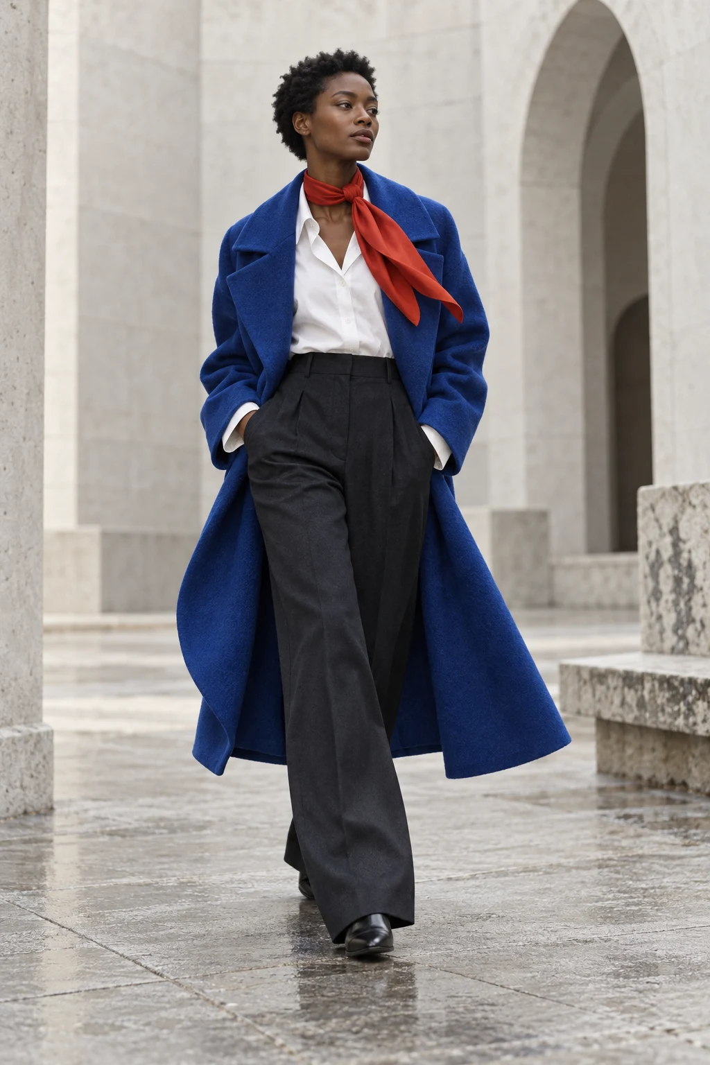
British Vogue identified red and blue in Prada’s Autumn/Winter 2026 show, with related combinations at Celine and Loewe. The attraction is easy to understand: two strong colours make each other feel intentional. But the proportions decide whether the result whispers or announces itself.
The quiet version
Start with a navy base and add a small red element: a scarf, a sock or a bag you already own. Leave space between accents rather than repeating red at every possible point. One interruption is often enough to make the outfit feel considered.
The graphic version
Use a clear blue on the largest garment and a saturated red on a smaller one. A white shirt can create a pause between them. This is our suggested interpretation, not a recreation of a specific runway look. The accompanying image is generated editorial styling, not a photograph from Prada.
The softer version
Try a washed blue shirt with a deeper wine-red knit. The pair becomes quieter when neither colour is at maximum brightness. If the result feels too muted, add a small area of ivory rather than introducing a third strong colour.
Watch the surfaces
A shiny red fabric attracts light differently from matte wool. If your accessory seems louder than expected, it may be the finish as much as the colour. Move from artificial light to daylight before judging the combination.
There is no required ratio or personal-colour diagnosis here. The useful rule is to choose where you want attention to land. Try the pairing in the Colour Lab, then use the digital palette as a starting point rather than an exact match for real fabric.
Sources & further looking
British Vogue — Red and blue on the 2026 runwaysHistorical, material and collection references are linked above. Styling exercises and interpretations are our editorial suggestions.
