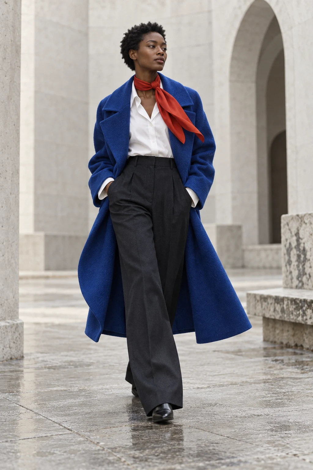
Plum and chartreuse sit comfortably outside the idea that all elegant outfits must be quiet. Vogue’s Fall 2026 colour report includes this broader movement toward expressive colour. The particular proportions below are our editorial suggestions, not a claim that every house used the same pairing.
Let one colour lead
Begin with deep plum trousers and a top in the same family. Add chartreuse close to the face or at the hand, rather than at both points immediately. A scarf or small bag is a low-commitment way to see whether you enjoy the contrast.
If the green-yellow feels too electric, reduce its area before changing the whole outfit. A narrow cuff or a sliver of a layer can carry the idea. Colour has a volume control, and the size of the garment is one way to use it.
Try a third shade only when needed
Warm ivory creates a pause. Charcoal grounds the combination more firmly. Choose one and compare it in natural light. Adding several neutrals can make a deliberate pairing look like an accidental collection of unrelated pieces.
Two versions to compare
- Evening: a plum base, one small lustrous accent and simple footwear.
- Day: a matte plum knit, a pale neutral layer and a chartreuse accessory.
These are outfit formulas, not shopping lists. Substitute the nearest shades already in your wardrobe. A slightly different green may be more interesting than a precise digital match.
Keep in mind that screens exaggerate some colour differences and erase others. The final decision belongs to the garments in front of you. Place them together, step back and see whether the relationship still works at the distance from which an outfit is normally seen.
Sources & further looking
Vogue — Fall 2026 colour reportHistorical, material and collection references are linked above. Styling exercises and interpretations are our editorial suggestions.